
Synopsis
Summary:
Macmillan Learning wanted a note-taking app geared towards helping students learn, especially neurodivergent ones. I joined the project as the UX designer at its infancy, aiming to develop it into a proof-of-concept.
Delivered:
A 40+ screened, high-fidelity prototype backed up by 39 research participants, 50+ ideas, several rounds of testing, including A/B testing, and 4 iterations, that was ready for proof-of-concept.
Duration:
10 weeks
June 2025 - August 2025
Team:
Jenn Padilla
UX Designer/Researcher
Camecee Pyle
Project Manager
Service:
-
9 in-depth interviews
-
50+ ideas
-
40+ sketches
-
20 A/B tests
-
10 usability tests
-
4 prototype iterations
-
1 custom ChatGPT agent
Helping Macmillan Build a Student-Focused Note-Taking App
Results
-
A social campaign that generated 231 qualified leads in one week in a single channel
-
53% higher conversion rate and 44% lower CAC than the baseline
-
Release target is October 2025

You can try it out yourself by clicking here. Its purpose was to support usability testing and to showcase what is wanted for the proof-of-concept. Complete functionality was not the goal. Please keep that in mind when navigating.


Problem
Solution
Who:
College students, especially those who are neurodivergent or have high information loads,
What:
Struggle to regularly review their notes outside of class.
Why:
Notes are difficult to find, students forget to review, or when reviewing feels like an ineffective and overwhelming task.
Consequences:
Shallow retention, last-minute cramming, and a loss of academic confidence.
A high-fidelity prototype of a note-taking web app that...
-
Organizes school notes through course folders and a global search
-
Utilizes AI to support students during the note-taking process, offering options to summarize, highlight key points, and organize their notes.
-
Becomes an AI-powered study aid with flashcards and quizzes pulled from the students' notes.
Process
Define
Empathy
Define
Ideate
Prototype
Test
Prototype
Test
Prototype
The journey was winding, but intentional. I repeated different steps in the design thinking framework, like define, test, and prototype, because the project demanded it.
Presentation
Before I departed from Macmillan Learning, I had the opportunity to present my case study to the team and Macmillan Learning higher-ups, like the CEO, Susan Winslow. Above is that presentation. It is similar to the journey below, so you'll get the full picture whether you prefer to watch or read.
This is the end of the case study's synopsis. Below is the journey I went through for this project. Enjoy!
The Journey
-
Foundation
-
Interviews
-
Problem Definition
-
Goals
-
-
Acrchetypes
-
Ideation Board
-
Flowchart
-
Sketches
-
User Testing
-
Mid-Fi Prototype
-
Usability Tests
-
Hi-Fi Prototype
-
Time-line
-
Measurement of Success
-
What I've Learned
-
What I Would've Done Differently
-
Looking Back
-
Recommendations
Discovery
Inheriting the Vision
This is the research that was conducted by my product manager, Camecee Pyle, prior to me coming on.
No existing tool effectively supports structured and flexible academic note-taking.
The Missing Tool
-
Centralized, low-friction system
-
Support for review habits
-
Quick-switch templates (outline, sketchnote, and socratic methods)
Student Wishlist
Features like search and side-by-side views solve the biggest pain points.
Insight Highlight
Close, But Not Quite
My project goal shifted at the end of my interviews
Original Goal: Help students take better notes
New Goal: Help students review and organize their notes
Thankfully, my interview questions covered topics related to both problems, so the data did not go to waste.

Voices Behind the Notes
Interviews
Participants:
-
9 participants
-
College sophomores to PHD students
-
3 neurodivergent participants
-
All students went to Texas Universities
Why Interviews:
To gather Qualitative data directly from the source, struggling
college students.
Objective:
Validate or challenge the original problem by understanding how college students take, study, and view
their notes.
How Did I Conduct the Interviews:
I conducted nine 1:1 interviews with diverse students, asking them to walk through their notes while reflecting on their challenges.
Findings
Cognitive Strain
-
Mental overload from fast-paced lectures
-
Feel like they miss key information, with some unsure what to record
Lost Notes
-
Can't find notes because of disorganization and notes spanning different mediums
and apps
Structure Meets Freedom
-
Desire for structure, but freedom when
note-taking -
Some students include drawings or picture
Study Habits
-
Review habits vary widely, but are consistent among test-focused students
-
ADHD students express a desire to review, but don't follow through

Takeaways: What Students Struggled With
-
Note-taking styles are personal and well-established.
-
Students feel like they miss key info.
-
Finding past notes is difficult.
-
Study confidence varies.
-
ADHD Students want to review but don't.
Learning Through Story
A neurodivergent student mentioned that framing data as stories helped her.
There is a lot of evidence that story-framing could benefit Stitched, such as:
-
Story-framing enhances memory retention and structures information
-
Emotional connections strengthen memory
-
There's little competition with story-framing
-
Storytelling helps all students, not just neurodivergent students.
This was a concept we were excited about at the moment.
Clarifying the Challenge
This was when I arrived at the current definition of the problem. I took time to create a "Definition" document so everyone, including me, was on track.
Design Goals
Primary: Must-Haves

Effortless Review
Secondary: Should-Haves

Find Notes, Fast
Review needs to be timely, lightweight, and emotionally encouraging, not a chore.
The tool should foster a sense of orientation and progression across time or tools.
Tertiary: Nice-to-Have

Your Notes, Your Way
A successful system must accommodate multiple mental models.
Who We Are
Designing For
Why Archetypes:
I decided to create archetypes over personas because archetypes center around need states, not demographics. We wanted to focus on the diverse student behavior.
Objective:
The archetypes were created to be a north star for the students’ needs and struggles. They were instrumental to the ideation phase.
How Did I Create the Archetypes:
The archetypes were based on the qualitative data from the interviews.

These students, often neurodivergent, struggle with the whole note taking and reviewing process.

These students have a system in place for note-taking and studying, but could benefit from flexible tools.
These students, often neurodivergent, struggle with the whole note taking and reviewing process.
Meet Our AI Intern
At the beginning of the job, I was introduced to custom ChatGPTs. After making Shaggy the Therapist, a custom GPT where Shaggy from Scooby-doo gives unlicensed therapeutic advice, I created a custom GPT that acts as a database for Stitched. Throughout the project, I uploaded any related files so anyone on and adjacent to the team could ask questions and receive synthesized data.
It struggled with hallucinations at times, especially when it came to dense files like Excel sheets, but it proved to be overall helpful.
Competitive Research
I picked out the social media platforms people mentioned in the survey and compared them. I tried to give a gist of each platform while also covering themes expressed in the survey. Those themes include flexibility and options in posting, algorithms, and threats of art being used to train AI images. Please note that all pictures online can be used to train AI image generators, but Instagram and DeviantArt specifically use images on their websites to train their own AI generators.

Of this list, Instagram seems to be X’s biggest competitor. However, despite its large monthly active user count and being an image-focused platform, Instagram goes against a lot of Artists’ values. Instagram has no alternative to its algorithm-based feed, and users’ public images on Instagram are being fed into Meta AI, an AI image generator. There are also restrictions when it comes to posting, such as the inability to post from a desktop and making scheduling posts a premium feature.
Instagram was not popular in our survey. Three different participants wrote, “It’s not Instagram,” when asked about the positives of X. However, it’s important to relay that we got our participants through X. I’m sure we would’ve heard a different side if we recruited users through Instagram.
Create
Mapping the Possibilities with 50+ Ideas
The ideation workshop was fun. I'm biased towards vomiting all my ideas out, so I went with brainstorming.


In a workshop I conducted, 6 ideators offered their ideas, including the project manager and Macmillan designers, adding up to 50+ ideas.
Setting up for Success
Alongside the archetypes in the Mural board were general problems that students had
to remind ideators of what they are ideating for.

Reverse-Brainstorming
On the board was a section for Reverse-Brainstorming, an ideation tool where you write down bad ideas that go against the goal.
Why?
This helped our team to uncover hidden issues, break out of habitual thinking, and generate more creative, unconventional solutions.


Narrowing it Down
After a few days of ideation, I sorted the ideas by function. From the affinity map, I organized ideas by impact, and from there, Camecee and I ranked the ideas we thought were the best fit for Stitched through a voting system.
There were a lot of gamification-type ideas that didn't make the cut because they weren't high priority.
Unfortunately, functionality and meeting goals come before whimsical joy.
Our Current Stance
Notable values at this point
-
A PDF and note side-by-side view is still the top priority
-
Templates for note-taking styles
-
AI story-framing fueled by students’ notes
Notable low-priority values
-
Flashcards
-
Template-free note-taking option
I included the low-priorities because they ended up being part of the final product.
Charting My Course
Flowchart
The Flowchart was primarily for me. I was struggling to start sketches because it felt overwhelming. After mapping out the web app using a Flowchart, I found that sketching became easier.

The Flowchart laid out Stitched’s flows to pave the way for the upcoming wireframes.


Sketch, Reflect, Repeat
I went through many iterations, incorporating and getting inspired by the internal design team’s feedback.

User Testing
“[Stitched would] save me a lot of time in organization of my notes and it would ... help me turn those notes into useful study tools”
Participants:
-
20 participants
-
College freshmen to master's students
-
4 neurodivergent participants
-
Found on UserTesting.com
Why User Testing:
So far, I haven't had feedback from actual users; this was my way of reaching out to them.
Objective:
To understand students’ perspectives on the product to inform adjustments.
How Did I Conduct the User Tests:
Through UserTesting.com, I uploaded images of my sketches and asked participants to give their impressions and assumptions. There were 4 tests, two pairs of A/B testing. A/B were desktop, C/D were mobile.
Most questions asked for verbal responses, so I had to watch all the videos all the way through.
Participants Fell Into Two Categories
Study-First Students
-
Students who praised Stitched’s review methods, such as flashcards, quizzes, story framing, etc.
-
This included all neurodivergent students

Organization-first Students
-
Students who praised Stitched's clean interface, PDFs side-by-side, global search, clear structure, and tidy hierarchy
-
15% of students fell into both categories.
The Bad: Usability Confusion
The Good: Desired & Delightful
Difficulty Linking or Importing Physical Notes
-
4 students explicitly said they didn’t know how to upload or scan paper notes.
Feature Labeling and UI Uncertainty
-
Multiple testers misinterpreted visual buttons, especially Study Mode, Transcript, or icon-only features.
Confusion About Study Features
-
Most students were confused by at least one study mode (especially Story Time, Fill-in-the-Blank, Transcript).
-
Stitched had an average Delight Score of 86 out of 100.
-
Stitched meets the organizational desires of 15 (75%) of students.
-
Side-by-side note/PDF viewing was frequently called out as “genius” or a key benefit.
-
At least 6 students described Stitched as “better” than Google Docs, Notion, or their current system.
-
Confusion was low in core flows like navigating into a class, searching, and reviewing.
A/B Testing: Tied Between A & B
Looking at specifically the A/B and C/D results from the A/B testing, students were split. They liked different things about each design. Moving forward, I picked different aspects from each wireframe, based on the students' thoughts.


Some of their opinions could be predicted by which test they took. Students who started their test with wireframe D, the last mobile screen, liked the simplicity of the icons in wireframe C. However, students who started with wireframe C did not understand what the icons meant, so they naturally gravitated to the buttons being written out like they are in D.
Neruodivergent Students Were Especially Delighted
-
4 out of 4 prefer hand-writing their notes
-
4 out of 4 had high enthusiasm for the study tools, especially Quiz and Flashcards
-
4 out of 4 preferred wireframe C
-
4 out of 4 rated Stitched high on usefulness and surprise
-
3 out of 4 showed interest in multimodal capture (scanning, recording, and AI assist)
Takeaways: Taking Home Rich Data
-
Students are excited for Stitched due to its organization and study features.
-
Students struggled to figure out how to import notes.
-
I need to label the buttons more clearly.
-
-
Preference was split evenly between A/B/C/D;
-
The best action to take moving forward is to combine what students like.
-
-
Neurodivergent students are enthusiastic about Stitched and its study mode, and lean heavily towards writing their notes.
Change in Direction
Results from my Camecee’s testing created a shift in direction.
-
Stitched’s new goal, in addition to its current objectives, is to serve as a student's AI academic companion. AI features became a focal point. This complemented what I saw in research and testing. Students were looking for academic support and confidence.
-
We dropped note-taking style templates. In a card sort test, students ranked note-taking styles low.
I kept up with the changes and adapted my work to fit.


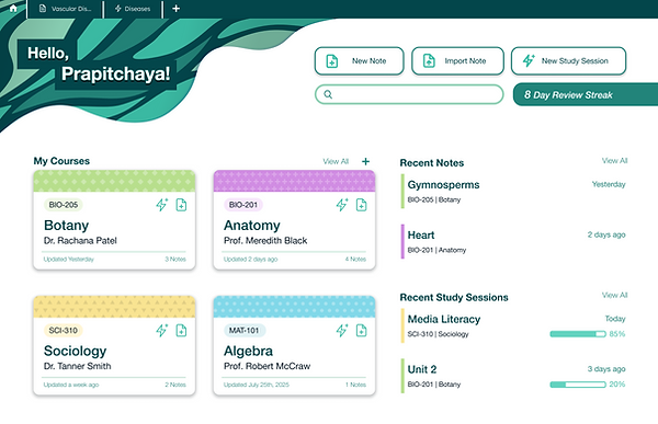
Mid-Fidelity Prototype

Dashboard
With the feedback from my co-workers and the A/B testing, I updated the dashboard.
I opted for a toggle for the different Note and Study sides because the web app felt split, and there wasn’t enough room in one dashboard for each side.

Study Mode
It's in the mid-fidelity that I materialized the different study methods, flashcards, quiz, story-framing, and summary.


Refinement
Cuts
Getting closer to a Proof of Concept release and going through tech validation led to narrowing the scope.
Features that did not make it to Proof of Concept are:
-
Some study modes (Summary and Story-Framing)
-
Digitizing images of written notes
-
Notifications to study
-
Dark mode
Which, honestly, was a bit disappointing to come to these decisions. The first 3 features were made with neurodivergent students in mind, and dark mode is a standard accessibility feature.
However, this didn't mean Stitched would never carry these features. The web app needs the essentials first to get out the door. Stitched needed to crawl before it could run.

Usability Testing
“Kind of reminds me of Notion but easier.”
Participants:
-
10 participants
-
College freshmen to master's students
-
2 neurodivergent participants
-
Found on UserTesting.com
Why Usability Testing:
At this point, Stitched’s concept is now fixed. The next step is to gauge the usability of the design.
Objective:
To assess students’ ability to navigate various features of Stitched in different scenarios, such as class lectures and studying.
How Did I Conduct the Usability Tests:
Through UserTesting.com, I uploaded 1 test that required doing tasks, writing answers, and rating the task’s difficulty.
Pain Points
The Good
Students did not interact with the study side of Stitched
“I don’t like that the study section is hidden; you have to go through the top menu to find it.”
-
Students didn’t go to the separate study mode to study their notes. They stayed within the note side.
Students choose more tedious ways to navigate the app
-
When completing tasks some students used methods that take more time and effort than the ideal path.
-
All students started a New Note quickly
-
Most rated Nebula as useful (4–5 out of 5)
-
Global search and Side-by-side view was intuitive and praised
-
Both organization-first and study-first needs were met
-
Students said Nebula could replace Google Docs + Quizlet
“[Stitched is] Quizlet on steroids”
Neurodivergent Students
Neurodivergent students were less surprised, thus less delighted.
-
Neurodivergent students rated lower in the pleasantly surprised scale, which helped bring the average delight score from 86 on the last test to 81.
-
Could be due to neither student seeing the study mode page, something that past neurodivergent students really like. They did not see it, because of the first pain point
-
“It didn’t feel very surprising.”
Neurodivergent students found creating a new study session difficult
-
Neurodivergent students rated this task a higher difficulty
-
Possibly cognitive-load cues or labeling need work.
Takeaways
-
Students are not reaching the study side of Stitched. I need to:
-
Fuse the two dashboards into one for more straightforward navigation
-
Create study mode paths on the notes side of the website for students who prefer to use Stitched's note organization.
-
-
Some students think the "Magic Edit" button is a spell checker.
-
I should consider changing the feature's name and incorporating a spell checker in the web app automatically.
-
-
Students are still excited about Stitched


High-Fidelity Prototype
Changes
Changes were made to make Stitched easier to navigate and to accommodate students who prefer to move through the courses.
-
Combined dashboard
-
Options to start a new study session within the course/notes navigation
Based on research, time constraints, and efforts to make Stitched more accessible, some aspects were let go, at least for the Proof of Concept phase.
-
Notes/Study toggle on the dashboard
-
Alternative study modes like Summary and Story
-
The font Akshar, in favor of a more delexic-friendly font, Helvetica

Color
Color palettes are essential to an app’s brand and feel, so I made sure to explore multiple avenues. As a professional color designer in the past, I had a lot of fun.
Logo
I was also asked to tackle the logo
I went through several iterations to find a logo that encompasses Stitched's name.
Moving Forward
What did I learn?
It's ok if your project falls short of your original vision. If you can get it started, you'll have opportunities to make your vision come true in future revisions. If you can't get the basics down, there will be no project.
This was a lesson I had already experienced, but this time I had to leave behind features I felt were important to my core audience, neurodivergent students. I think back to what one of my interviewees said when I asked her, "What would make you try a new digital note-taking app?"
"Inclusivity. A note-taking app that partially or fully caters to neurodivergent people that would assist them where their brain falls short." - Janet
What I am getting at is it's hard. I just have to be confident in my skills to advocate and trust that my voice has been heard. I can only hope that features designed for neurodivergent students are high on the list of features to add in future editions.
My recommended feature for V1
-
Story-Framing study method
-
Options for students to see the note that the study session pulled from in the study session
-
Study Notifications
-
Digitizing images of written notes
-
Dark mode
What I Would've Done Differently?
It sounds kinda silly, but I wish I had printed out the archetypes and reports and taped them on my wall. I often got lost in what I was currently looking at the time, and being able to stand up and look at everything together would've strengthened my sense of direction. I wasn't thinking of the disoriented drifter through the process, which defeats the purpose of an archetype.
What's next?
I have handed the proof of concept over, so my part is done. In general, Macmillan will implement the concept so it can be tested. If that is successful, it will go to market, and they will continue to build on it.
Measurement of success
For the proof of concept, the requirement:
-
10-20% of students continue to use Stitched
-
Infrastructure works as intended
Goal
-
65% of students who pick Stitched up do not abandon it
-
65% of students who pick Stutched up uses there review features
Thanks
I am very thankful to Macmillan Learning for the opportunity and for my colleagues for being supportive. This project is early in my UX career, and Camecee and the other UX designers were always patient and gave good feedback. I am also thankful for the participants in the interviews and tests. Couldn't do without them, literally.
If you yearn for research,
Comfort Games is the
place to go!